🔺
Chips
Tiny edible shovels for transporting molten happiness directly to your face.
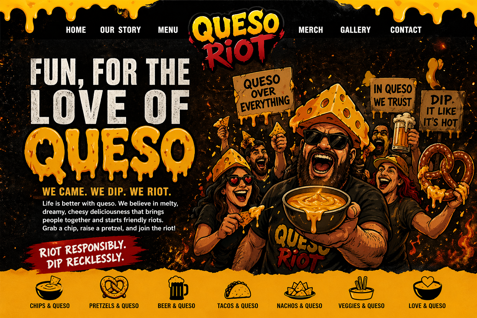
A silly, melty, snack-fueled celebration of people losing their minds over cheese dip in the happiest possible way.
Chips are cheering. Pretzels are cannonballing. Beers are foaming with excitement. Someone put on a cheese hat and declared, “I regret nothing.” Welcome to the Queso Riot.
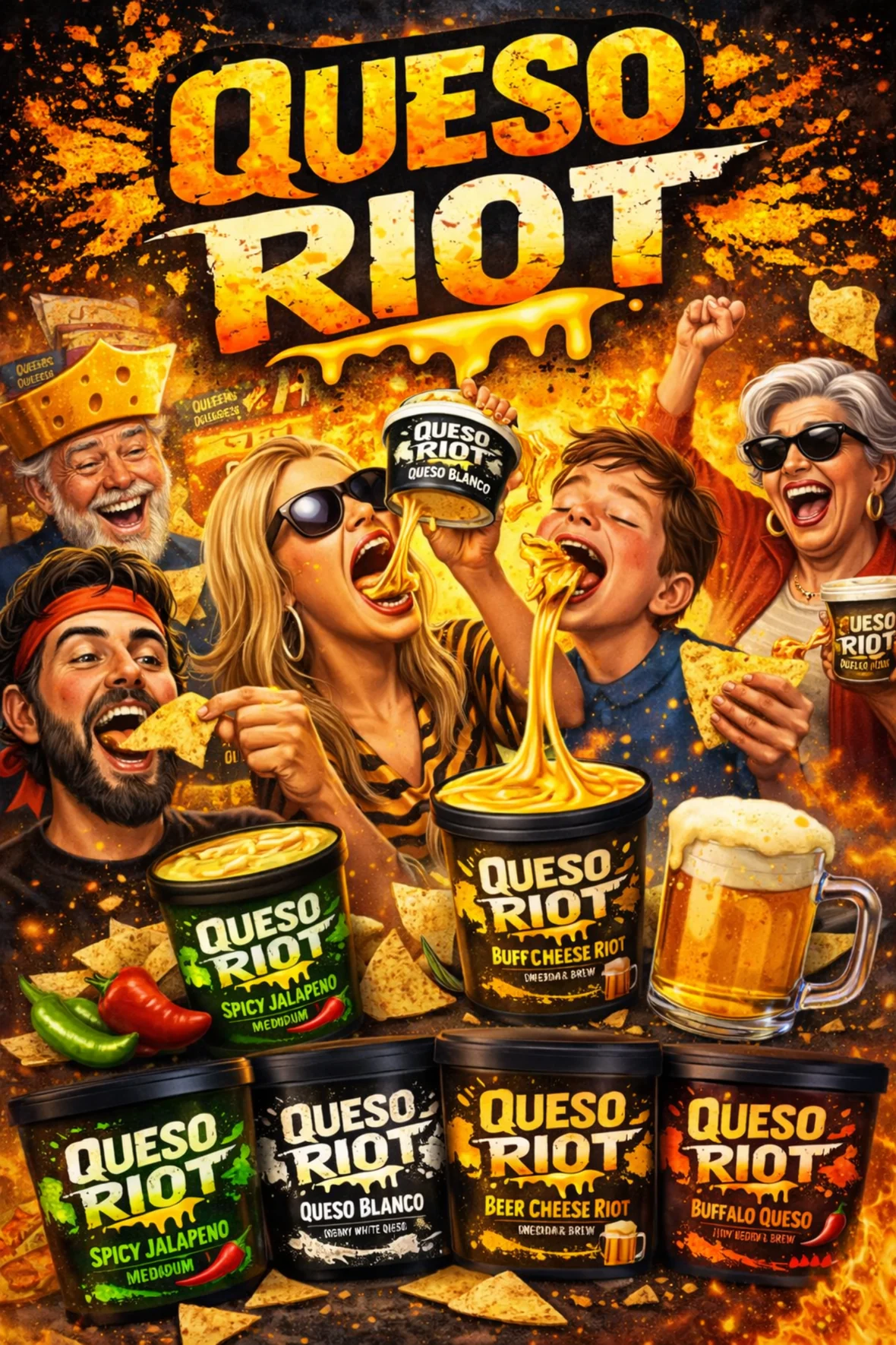
Nobody is safe from the golden pour. Not the chip. Not the soft pretzel. Not the beer. Definitely not your good judgment.
Tiny edible shovels for transporting molten happiness directly to your face.
Twisty, salty, theatrical. Born to be dunked like a snack gymnast.
Pairs well with queso, yelling “try this,” and pointing at the dip like it owes you money.
Formalwear for the queso uprising. Ridiculous? Yes. Necessary? Also yes.
If the queso is not stretching, dripping, or threatening to escape the bowl, keep pouring.
Half-dunks are for people with meetings. Full commitment only.
Everyone gets a chip. Everyone gets a laugh. Someone inevitably gets queso on their shirt.
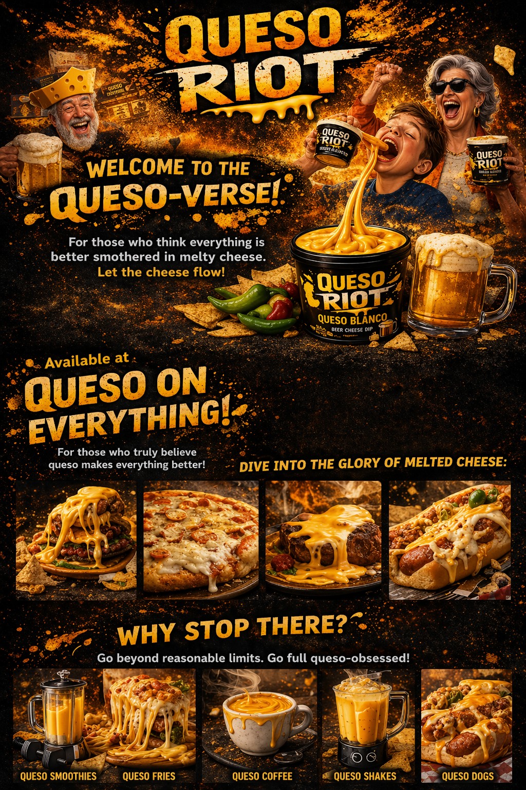
What began as dip has become a lifestyle choice, a tabletop event, and possibly a minor cheese-based weather system.
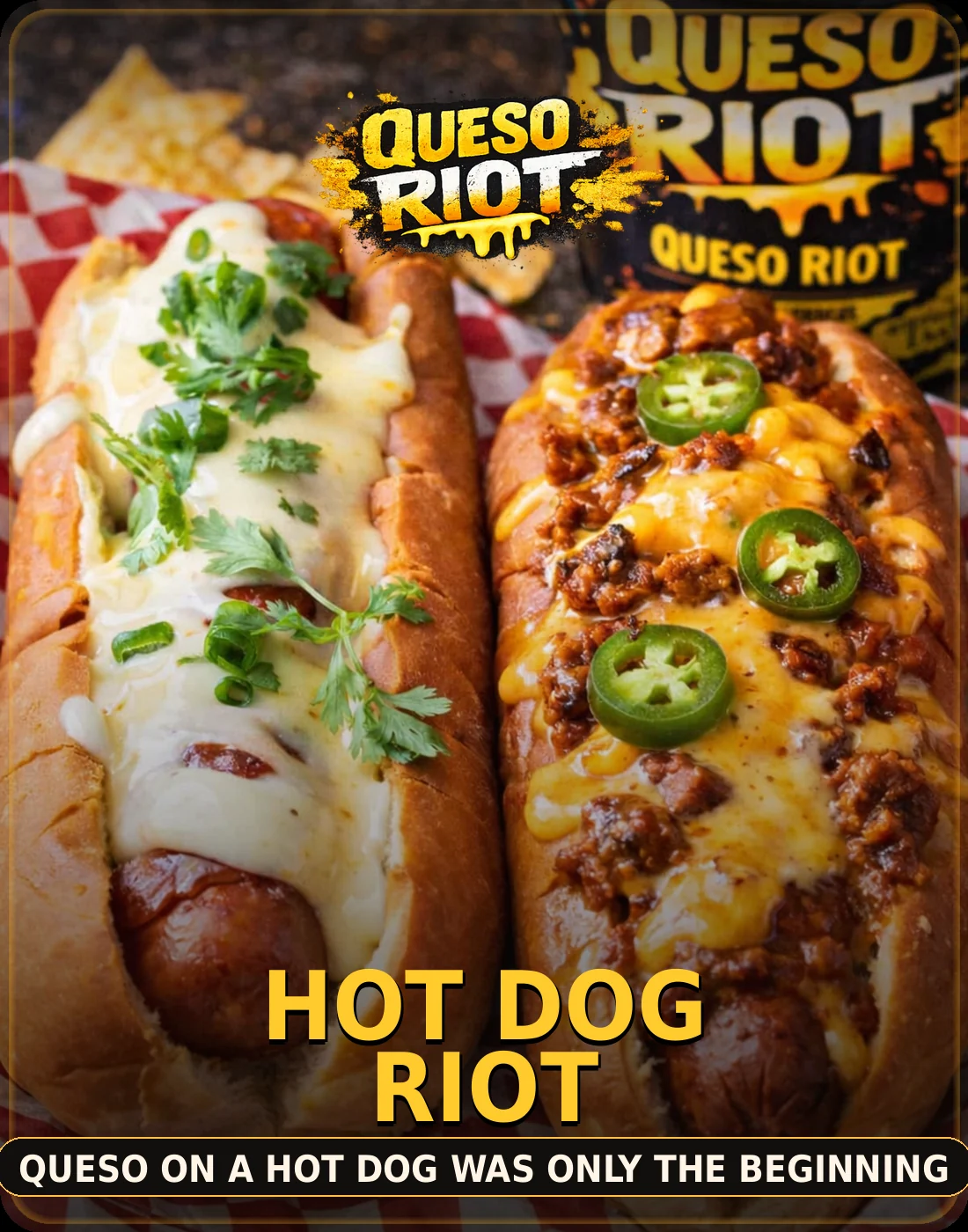
Ballpark food wearing a queso tuxedo.
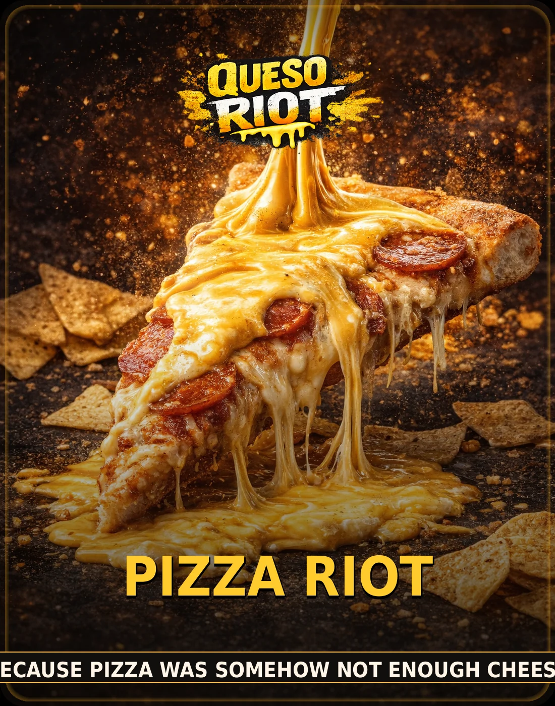
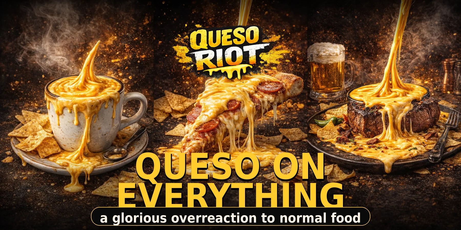
Cheese on cheese. We checked. It is legal.
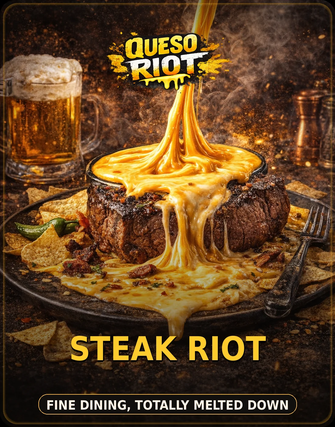
Fine dining, but somebody brought a ladle.
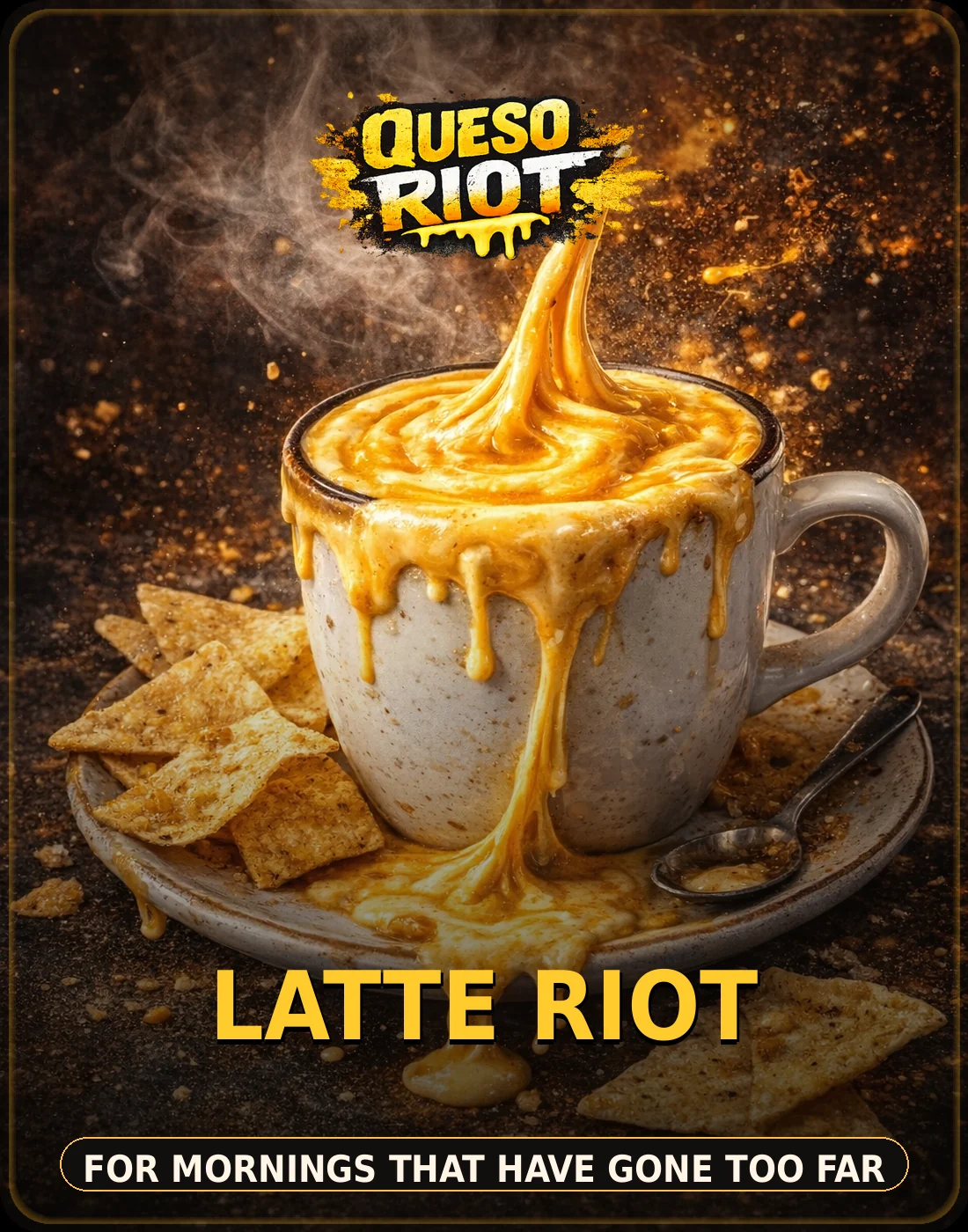
Do not drink this. Do stare at it and laugh.
A little microcopy wall to make the whole page feel alive, loud, and aggressively pro-dip.
“I came for one chip and left emotionally bonded to a tub.”— local dip witness
“Put queso on the pretzel and nobody gets mildly disappointed.”— snack negotiator
“This beer has a best friend now. Its name is queso.”— foam scientist